Creating an Impactful Contact Us Page
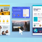
A well-designed Contact Us page is a crucial element of any website. It serves as a gateway for visitors to reach out to you, providing valuable opportunities for engagement, lead generation, and improving customer service. In this article, we will explore the essential elements of a great Contact Us page and showcase inspiring examples from various industries. By learning from these examples and implementing best practices, you can create a Contact Us page that leaves a lasting impression on your audience.
The Power of a Clear Call to Action
A compelling Contact Us page starts with a clear call to action that encourages visitors to take the next step. Whether it’s a simple “Contact Us” button or a personalized message, the call to action should be prominently displayed and easily accessible. Take inspiration from Search Engine Journal’s Contact Us page, which uses engaging language like “Have questions? Shoot us an Email” to capture visitors’ attention.
Easy Navigation for Seamless Communication
When designing your Contact Us page, prioritize ease of navigation. Visitors should be able to find the necessary contact information without any hassle. IMPACT’s Contact Us page sets a great example by including a video message alongside a clear call to action. This combination provides a personal touch and guides visitors towards the contact form.
Personalization and Assistance
Personalizing the Contact Us experience can greatly enhance customer satisfaction. Netflix excels in this aspect by greeting users by name and offering tailored recommendations. By understanding the customer’s needs upfront, you can provide relevant assistance and streamline the support process.
Visual Appeal and Organization
The visual presentation of your Contact Us page plays a significant role in user experience. Peloton’s Contact Us page effectively combines images and text to provide clear options for users. Categorizing inquiries and directing visitors to the appropriate department can help streamline communication and ensure prompt responses.
Transparency and Multiple Contact Options
Transparency builds trust and reassures visitors that their concerns will be addressed. Freehand Goods showcases their contact points prominently, including their address, hours, and clickable icons for social media accounts. By offering multiple contact options, you cater to different user preferences and provide flexibility in communication.
Comprehensive Support and Quick Solutions
A well-rounded Contact Us page should cover a range of customer needs. Terminix excels in this regard by offering multiple ways to get in touch, such as phone, email, chat, and even a service locator. Additionally, providing quick solutions or Frequently Asked Questions (FAQs) can empower users to find answers without direct assistance.
Streamlined Search and Self-Service Options
Some users prefer self-service options before reaching out for support. Kohl’s Contact Us page stands out with its prominent search bar and categorized FAQs. By enabling customers to find answers on their own, you enhance their experience and minimize unnecessary contact.
Conclusion
Creating an impactful Contact Us page is a vital aspect of website design and customer engagement. By incorporating the essential elements discussed and drawing inspiration from the examples provided, you can design a Contact Us page that facilitates seamless communication, captures leads, and enhances customer satisfaction. Remember to prioritize clear calls to action, easy navigation, personalization, visual appeal, transparency, comprehensive support, and self-service options. By implementing these best practices, your Contact Us page will become a valuable resource for visitors, strengthening your brand’s credibility and fostering meaningful connections with your audience.


