Converting visitors into leads is the first step in creating a relationship between your company and a potential customer. Landing page is an essential factor in social media marketing. Everything you need to know about what landing page is and how it works is right here.
What is a Landing Page ?
In digital marketing, a landing page is a standalone web page, created specifically for a marketing or advertising campaign. It’s where a visitor “lands” after they click on a link in an email, or ads from Google, Bing, YouTube, Facebook, Instagram, Twitter, or similar places on the web.
Unlike web pages, which typically have many goals and encourage exploration, landing pages are designed with a single focus or goal, known as a call to action (or CTA, for short).
It’s this focus that makes landing pages the best option for increasing the conversion rates of your marketing campaigns and lowering your cost of acquiring a lead or sale.
Before You Build a Landing Page
1. What is the goal? In an ideal world, what would visitors do upon reaching your landing page? Would they buy something? Fill out a form? Sign up for a newsletter? Download an eBook? Toss aside their keyboard, break out a harmonica, and play a sweet blues rift? The first step for any strategy is determining goals. (You have to define conversions before you can track conversions.)
2. Who am I competing against? Really it’s three questions: Who am I competing against, how are they succeeding, and how can I copy their success? Imitation is the sincerest form of flattery, so if your competitors are doing something that works, you should go ahead and follow likewise. They’ll thank you for it (although that’s not a promise…)!
3. Who is my audience? And what are their hopes, dreams, and aspirations? As silly as that sounds, it’s true to some degree – the better you understand your audience, the more you can cater to their wants and needs. Unless you know who your ideal customers are, it will be very difficult to write persuasive copy in the voice of the customer. So get in your audience’s head, Hannibal Lecter-style.
4. How did they get to my landing page? Ideally you want a tailored landing page for each ad group, but that’s a pretty hefty operation, so start where you can. Try beginning with one custom landing page per campaign, and add from there for individual ad groups when resources allow.
How Do Landing Pages Work?
- A person sees a call to action and ends up on a landing page with a form.
- The person fills out a form, which converts them from a visitor into a lead.
- The information from the form fields is then stored in your leads database.
- You market to the contact or lead based on what you know about them.
A nurtured lead is more likely to become a marketing qualified lead (MQL) and move through the marketing funnel faster. This helps show the return on investment (ROI) of your marketing efforts and keeps your sales team happy.
Also Read:
Social Media ROI : A Complete Guide to Measure it For Your Business
How to Make Great Landing Pages
Are short, sweet, and uncluttered. A landing page should offer all the necessary information, but not so much as to overwhelm (and as a result, drive away) the visitor. Provide the essential info that will interest your audience and nothing more.
Provide high-quality content that inspires confidence. We just discussed how you don’t want to information-smother visitors, but this isn’t to say you should be cheap with your content – on the contrary, provide rich, useful content, so long as it is relevant. Good, confident content inspires trust.
Have all roads lead to Rome. Great landing pages keep careful note of all pathways entering and leaving their page. It’s important that you limit exit points (in this case, hyperlinks) leaving your page. The goal is to funnel visitors down a desired pathway, and if links serve as points of departure from the funnel, they should be used sparingly.
Make it easy to convert. The goal is to make it as easy as possible for visitors to convert, providing as little distance and as few barriers as possible between points A and B. The next step should always be obvious. This strategy varies depending on what your desired conversion is.
The Key Difference Between a Homepage and a Landing Page
There are a handful of things that set homepages and landing pages apart. Homepages have:
- More links. On a typical homepage, you can find at least 10 links. There’s often a navigational menu at the top, links in the footer, and many in the page’s content. On a well-optimized landing page, though, you’ll usually find fewer links, and sometimes only one—the link that allows your users to convert.
- Broader CTAs. Your homepage introduces your business and serves as a hub from which users can navigate to other corners of your site. Because your homepage has so many jobs to do, its content is often broad and has less specific CTAs (e.g. “learn more”). Since landing pages have 1 goal, they have tailored CTAs (e.g. “download our free eBook”).
- A different audience and purpose. Many of the people who visit your homepage probably haven’t decided what they want yet. On the other hand, users who end up on your landing pages have already shown interest in what you offer. They’ve ventured deeper into your customer journey and are more ready to convert.
Types of Landing Page
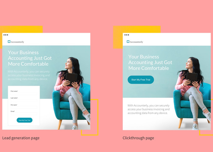
- Lead Generation Landing Pages: Also called “lead gen” or “lead capture” pages, these use a form as their call to action. This form almost always collects lead data, like the names and email addresses of visitors.
B2B marketers and companies selling high-ticket items use this type of landing page to build a list of prospective customers. They sometimes offering something free, like an eBook or webinar, in exchange for contact info. Ecommerce brands can also use these pages for list-building, or offering free shipping or special deals, too.
- Clickthrough Landing Pages: Frequently used by ecommerce and SaaS (software-as-a-service) marketers, clickthrough pages go straight for sales or subscription. Usually, they have a simple button as the call to action that sends the visitor into the checkout flow (like the app store) or completes a transaction.

Benefits of a landing page
Also Read:
Final word
When you make changes to your landing pages (e.g., copy, images, form fields), be sure to change one thing at a time and test for a while. That way you can identify what specifically is affecting performance and single that out. If you change multiple things at one time, you won’t know which change or changes affected the landing page and won’t be able to apply that knowledge toward future landing pages.


